
Géraldine puts her passion for the web, marketing and communication, writing and storytelling at the service of companies and entrepreneurs.
What do you want it to say about you? What are the pitfalls to avoid? How can it convey the concept of your restaurant? What criteria do you need to consider? Who should help you create it?
These are just some of the many questions you must ask yourself before choosing your logo!
A restaurant logo… for when, why, and for whom?
For when? Restaurant owners will have to think about their logo either when opening a new restaurant and creating its graphic identity, or when improving or modernizing an existing restaurant and its concept.
Why? Because the logo is a visual eye-catcher that can be found on all your communication devices, and because it will serve as a sign of recognition for your various targets.
 For whom? On the one hand, the public audience identified as the target for your restaurant.
On the other hand, the business audience, which must also be able to appreciate and recognize your image.
While this business audience clearly comprises your partners and suppliers, it also concerns potential comparator sites, online opinion sites, guides, blogs and other vehicles through which you will be visible…
Choice of logo – The choice of logo is a matter of particular importance to restaurant owners and entrepreneurs. Also, amidst all the facts and figures of your establishment’s business plan, it can be something nice to work on.
Your logo plays a considerable role in the expression of your restaurant’s concept, and represents something to which you will naturally want to relate. And yet, while you should certainly appreciate your own logo, remember it is not primarily intended for you. You must think about how it will be perceived and interpreted by your target audience. This means you should cast aside any personal references or private jokes for which the public is not in the know.
How important is the logo?
Obviously, even if the logo is an important component of a restaurant’s advertising, it is of lesser significance than the name of the restaurant. For all that, it must not be neglected. You and your audience will see it everywhere!
On the façade, on your menus, on your napkins, and sometimes even on your cutlery. It will also feature on your Internet site, on online comparators, in guides, and so on. Consequently, it must encapsulate your positioning and underpin your image.
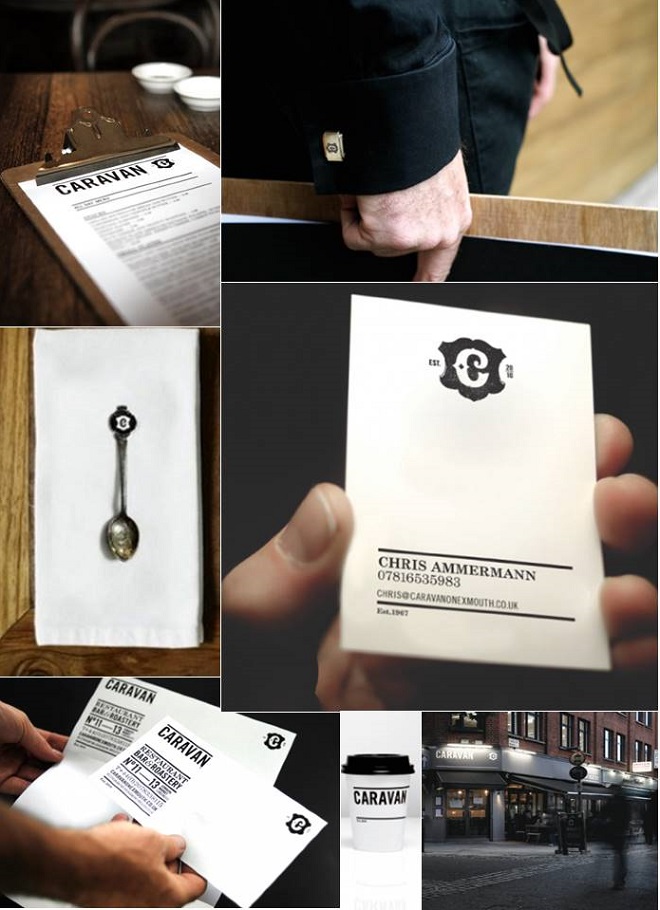
Graphic identity project created by the inhouse communication agency for the London-based Caravan bar/restaurant.
Obviously, your restaurant’s name and culinary reputation will always take priority, but if you make a mess of your logo, it will be meaningless at best, and harmful at worst. You must thus avoid any positioning errors, misperceptions and sources of confusion.
Is the logo permanent? How long should it last? Unlike the name of your establishment, which embodies and builds on all your acquired renown, you can change your logo if necessary, or better still, improve it. Note, however, that any change to your logo will infer changing all the corresponding materials on which it appears, which comes at a cost. So it is best to get it right first time, or at least to find one with which you are happy for as long as possible…
Creating a logo: style and content
Before you set about creating your logo, you should start by defining what you want it to say, and what you want those who have seen it to remember. At any rate, a logo can never “say it all”. However, it can deliver a precise message based on what it represents, and convey a certain status (traditional, avant-garde, family-oriented, select) via its style, its graphics, its appearance, etc.
Two levels of expression are at play: the message the logo conveys about your restaurant, and the way it conveys it through its style or design. It goes without saying that the logo’s design, along with the elements represented, must be consistent with the name, décor and positioning of your establishment. In short, with the concept of the restaurant.
For example, try to guess what type of restaurant these logos represent. Fast, Organic, Fun, Traditional or Functional…? Alone, a well-designed logo can express a restaurant’s positioning, target, atmosphere and spirit, beyond its cuisine.

1- Logo for the Caravan restaurant in London 2- Logo for the Bio Burger restaurant 3- Logo for the Pizza Cut restaurant
Unique Selling Proposition – Clearly, while certain criteria can be associated with a logo, it can’t say everything.
If, for example, you are opening a sushi restaurant, you can try to express its status – high end, traditional, hype or mainstream – via the logo’s representation and rendering…
However, you will be unable to encapsulate everything without leading to a complicated result that no one (except yourself) will understand, and that will simply be counter-productive. Try to highlight the name + 1 item of visual information (no more).
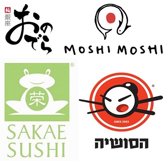
Based on these 4 logos, can you differentiate the concept of a high-end sushi establishment from those more oriented towards fast food or fast good?
Do not confuse a logo with an icon – The logo is not there to say what happens in your establishment (which is simply not possible), it is there to conjure up or evoke what happens.
Unlike an icon, whose role is to deliver a precise, limited piece of information (“do not expose to heat”, “machine-washable”, etc.) a logo is much more open.
Naturally, it can attempt to illustrate your positioning, if possible, but it can also convey an approach, an atmosphere, a trend. Sometimes just a given shape or a colour can do this.
Illustrative, symbolic or abstract? A logo is a subjective issue, so there will always be some counter-examples. However, generally speaking:
- the more the representation is descriptive, the more it conveys a functional positioning,
- the more the representation is symbolic or abstract, the more it conveys a trendy or high-end positioning.
The ideal positioning would be midway, to avoid alienating potential customers or leaving aside a portion of your target audience.
Staying with the sushi restaurant example: if you show a traditional dragon against a pagoda background, your positioning will be traditional/mainstream. If you show a mark in black ink (in the style of French artist Pierre Soulages), your positioning will be trendy, which may be suitable for a high-end restaurant (although few people will consciously establish the link).
One of the finest examples of sheer rigour, evocation and meaning can be seen in the logo used by a restaurant run by Michel and Sébastien Bras called Le Suquet, in Laguiole, Southern France.

Here, a simple sprig of cistre, a mountain herb symbolic of the surrounding region, allows the restaurant owner to assert his regional specificity via a symbolic, elegant logo that works equally well on paper, on a plate or on the web.
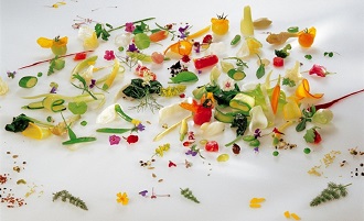
The use of black (which reflects the restaurant’s décor) gives a free rein to the colours of the dishes served.
Complementarity of the logo and the name of your restaurant
If your restaurant is called Al’s Diner, The Railway Inn or the name of a place (which, in itself, might convey a legitimate historical detail or a certain renown to be cultivated, but without necessarily evoking your concept), whereas you want to express a precise positioning, you can use the logo as a complementary symbol that will underpin your concept.
Situated in Berkshire, England, restaurant The Fat Duck from the famous Chief Heston Blumenthal, offers an original experience based on the five senses. The logo plays on this using the cutlery for fine restaurant experience but also on the name of a duck with beak, feather and foot.
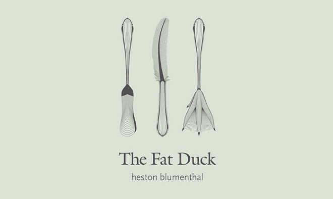
This logo thus does what the concept of finest food doesn’t (don’t expect to eat duck there…) in an amusing, elegant way.
Conversely, if the name of your restaurant already says it all, The Grill House, The Oyster Bar, or Beefbelly… this leaves you completely free to either “hammer home” your concept by illustrating the name, or to use a simple design, shape or colour to convey the spirit, atmosphere and tone.

4 fish logos for restaurants about see food and fish in UK: 4 similar culinary concepts with different positioning using a fish…
The more cryptic your logo, the more you will be upscale; the more descriptive your logo, the more you will be mainstream.
What is the point of monogram logos? While monogram logos may be considered more “classy” than illustrative logos, they have their limits. Having said that, anyone wanting to build on their own name as a restaurant owner or chef, like Jamie Oliver or Gordon Ramsay, can use a monogram logo.
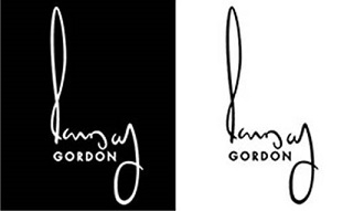
Classical or contemporary, the monogram is a safe bet, one that conveys a given signature and label. Here, the Gordon Ramsay logo, a direct, highly labelled transcription of the renowned chef’s signature.
Here is a counter-example. In 2014, the very prestigious Paul Bocuse establishment was “ripped off” with a logo for its website that happened to be a straightforward copy of a best seller among Hip Hop enthusiasts…
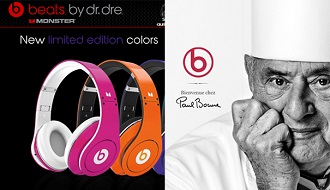
Hardly in need of accusations of plagiarism, Paul Bocuse quickly withdrew the offending icon and reverted to its original signature… Just as well in the end.

While monogram logos based on the initials of a person or place may work in some cases, in this last case, the establishment’s added value was lost along with the chef’s signature effect.
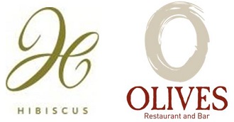
If you decide to use a monogram logo, you will have to compensate with a highly original or asserted typography which will serve as a visual statement. Here, it is the logo’s style and predisposition that will make the difference and set the tone, as with the logos used by Hibiscus Restaurant In Mayfair, London (which scream out “so hype” and “so trendy”), or Olives Restaurant (where the “O” reminds the form of an olive – the restaurant inspired by the Italian cooking, a olives country).
Is the colour decisive? Not really. While some claim that certain colours lend themselves well to food and others do not, each year, new takes on graphic design show that rules are there to be broken… albeit artfully.
One factor should guide you in your choice: a good logo should work just as well in black & white as in colour…
This is important because your logo will be displayed via different media, and not necessarily in colour. It may be shown in black & white, or even without any colour at all (for example, when embroidered on a napkin or embossed on plain paper). Again, as is often the case, the simplest logos are usually the best.
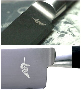
Here, the sprig of cistre, the symbolic logo of the restaurant run by Michel and Sebastien Bras, is delicately engraved on the establishment’s knives.
Who should you call on to produce your logo?
If you are tempted by one of the many websites that offer to produce your logo for you, be warned: they will never bring you the level of expertise and advice of someone for whom this task is the core business. In addition, you risk finding very similar logos elsewhere….
Depending on your financial resources, we advise you to contact a freelance graphic designer or a graphic design agency, or even a communication agency (generalist or specialist). Whoever you decide to work with, be sure to check out their references and their previous creations…
All that’s left to do is to rack your brains and draw on this article to establish your brief!
For your viewing pleasure: LOGORAMA
Here is a short animated French film that won over America. It is made entirely from animated logos (some of which correspond to leading “restaurant” chains you are sure to recognise)…
The aim of the authors was to remind us about our surrounding environment, which is full of logos, but which must now be constantly blurred out or hidden… In other words, to get back to the real world, one in which logos are everywhere. Here, the Ronald MacDonald logo is the bad guy for once… Warning: parental advisory!!
What about your restaurant’s logo? What story does it tell? What values and positioning does it convey? Feel free to share your comments with us and tell us how you went about creating your visual identity…
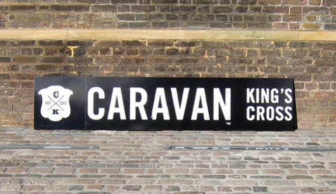
Source image: Caravan King’s Cross restaurant & bar logo from haveyouheardthelatest.com


Comments