

Géraldine puts her passion for the web, marketing and communication, writing and storytelling at the service of companies and entrepreneurs.
A dedicated internet site is a powerful marketing tool that you, the restaurant owner, can leverage to:
- Gain in terms of visibility and control over your image.
- Compete with other restaurants that have taken measures to adapt to the new market.
- Dialogue with your customers, obtain their opinions, secure their loyalty, know their expectations and acknowledge areas for improvement.
- Present your new menus, dishes and promotions, and share your establishment’s key events.
- Offer online ordering facilities without any intermediaries.
- Build a database.
- Invite your customers and prospects to join you on the social networks to consolidate ties and loyalty.
- Propose tailored marketing programmes.
- Pass on your press review.
- Etc.
The list is long. As a RestoConnection reader, I am no doubt preaching to the converted… However, in my view the key benefit of having your own Internet site is that it opens a window on the world (no less!) that is open 24/7! Just as you would tend to your high street shop window, so you must tend to your online window to the world because, in the words of David Swanson, “you’ll never get a second chance to make a good first impression“.
In the vast majority of cases, visitors to your site will land on your homepage. Consequently, it is your homepage that acts as a virtual – but very real – showcase. This is where you must focus all your efforts to attract your prospects’ attention, arouse their interest and stimulate their desire.
The first time visitors see your site is a unique opportunity to convince and inspire them by arousing emotions, if possible, and conveying a clear promise. You only have a few seconds to delight (or else repel) your visitor. This first impression is precious, so get straight to the point, i.e. that which defines you as a brand name, restaurant and/or business manager.
Restaurants with clear promises
The Bob Evans restaurant chain is an interesting example of how a restaurant can compose a website. As soon as you reach the homepage, you see:
- Pictures of dishes
- Offers with attractive prices
- Online ordering service
- Information
- A restaurant locator option
- Some recipes for family meals
- A visual environment that suggest generous, traditional and tasty cuisine…
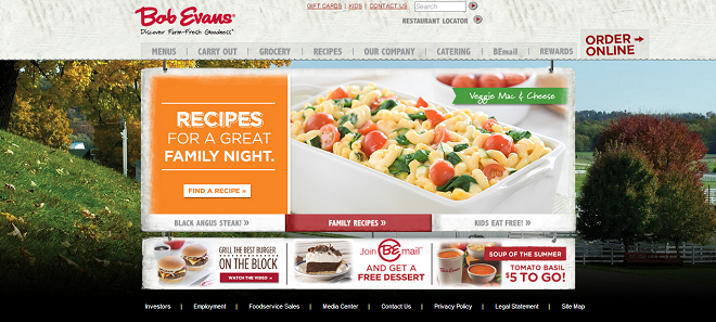
These elements are presented in an attractive, dynamic way that stimulates the visitor’s curiosity and interest, at least enough to want to take a closer look.
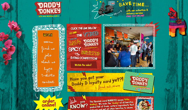
The Daddy Donkey site showcases its online ordering service right from the homepage and transports us in a colourfull and joyfull Mexican environment.
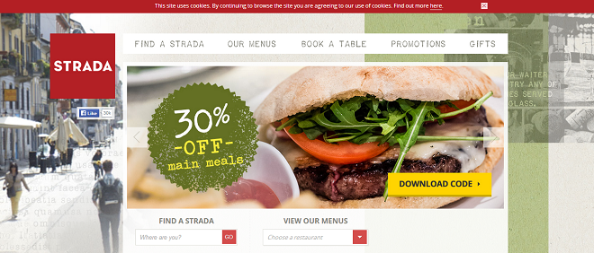
The pizza chain La Strada site stakes everything on its promotional offer, again, right from the homepage.
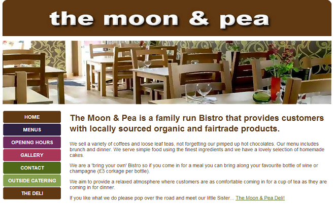
On The Moon & Pea site, the promise is clear right from the start “A family run Bistro that provides customers with locally sourced organic and fairtrade products”. The prospective customer can expect a a simple but tasty cuisine, prepared with local and fresh products and served in a family astomsphere without any frills.
Offer a unique sensory experience
An internet site is not a catalogue; it is an institutional and/or promotional communication vehicle. It is a virtual window in front of which your visitors should want to stop, feel their mouth start to water, and hopefully dream a little. When a visitor reaches the homepage of the following sites, he or she immediately gets a fairly clear idea of the restaurant’s style and what it offers. Emphasis is given to the establishment’s identity, thereby allowing visitors to imagine themselves via a specific sensory experience.
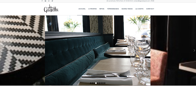
Look how easy it is to imagine yourself in the modern, cosy atmosphere of this french restaurant: La Gazette. You can already begin to see yourself comfortably seated in those plush couches.
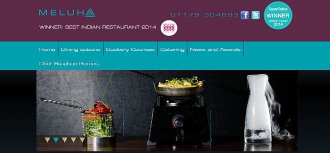
At Meluha, we are taken straight into an innovative Indian Fusion cuisine. Because it communicates on the Best Indian Restaurant award it received this year, we expect the chef Stephen Gomes to make us travel to India and to awake all of our senses.
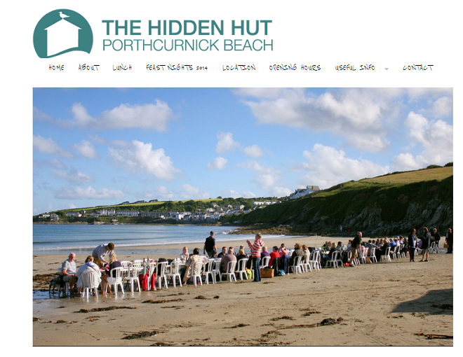
As soon as you see the homepage of The Hidden Hut, you are transported into a wild, natural and rustic atmosphere, ideal to unwind from the stresses of daily life.
How many restaurant websites have made you feel as if you had travelled somewhere special in just 5 seconds? Remember, whatever their destination, customers like to get away from it all. Eating out is all about entering a world of pleasure and sensory delights, regardless of whether you are selling pizzas, burgers or sushis. When designing your website, put yourself in the customer’s shoes. What do they want, and what do you have to offer that is unique and interesting?
Put the customer at the centre of your approach
The procedures for buying, booking and obtaining information must be simplified so that they are as straightforward as possible. Whenever possible, always clearly indicate a phone number, an e-mail address, and remember to include your Facebook, Twitter, Instagram and other social network accounts. If you offer an online booking or ordering service, make sure that it is clearly visible on your homepage. And then, we can never say it enough, photos are essential. For those few seconds of visitor attention, you must pull out all the stops so that the customer can browse your site easily and enjoyably.
Once the customer crosses the threshold of your establishment, you must make sure you honour your promise. Avoid over-selling yourself. Instead, go for a completely transparent, attentive approach: ask yourself why a customer would come back to your establishment. Better still, ask your loyal customers exactly what they expect of you when they come.
You only have a few seconds to convince the customer, so use them wisely, they could turn out to be exceedingly profitable for your restaurant! What emotions and information does your website bring you when you browse it?



Comments