

Chelsea Allenby is a Digital Marketer of 9 years and Managing Director of Allenby Digital Ltd, an online marketing agency she set-up in 2015, specialising in social media and content marketing. www.chelseamarketing.co.uk
Simply having an online ordering website is not enough, the actual online ordering experience is the most important thing. The tips in this article will focus on improving the customer experience and things to consider when choosing, designing or improving an online ordering system.
Get the Mobile Experience Right
It goes without saying that customers should have a mobile-friendly version of your website to use. The trick is to focus on the mobile experience first. Mobile traffic to your online ordering website will be more than desktop traffic, so this makes sense. According to Comscore, the Just Eat platform has 6 million unique monthly visitors in the UK and 73% are mobile-only visitors!
There is a clear difference between ‘mobile version’ and ‘mobile-friendly’. Information should be easy to find without the user having to think. Guide them through the process of landing on your website to placing on order with clear CTA’s (call-to-action) and good web navigation. Design is everything when it comes to the mobile experience and will greatly impact conversions (that is the number of visitors who convert to paying customers).
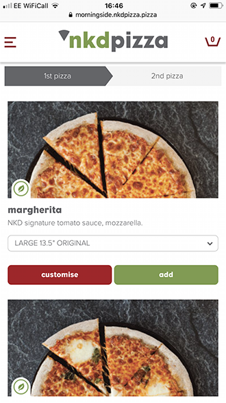
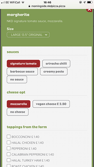
NKD Pizza, uses the Livepepper online ordering solution and is a good example of a simplistic mobile user-experience. It’s clear for the customer to see where and how to customise their pizza, select the size and add to the basket to check-out. The process is very ‘clean’ looking and easy to follow.
Here are some more tips:
- The process should be simple to go and back forth between different elements of the menu
- Make sure it’s no effort to go back and change the order before check-out
- Customisation options should be clear and easy to follow
- It should be easy and quick to pay
This might seem obvious, but the website should be tested from a customer point-of-view and sometimes it’s difficult to see this if you’ve been involved in the design process. Things are more obvious to you, such as where the ‘back’ button might be, or the ‘edit order’ element. To someone who has never seen the website, it might not be so obvious. If a user us struggling they eventually abandon the website.
Visuals Take the Lead
It’s always about the visuals. This is the case across all forms of online marketing, social, email, and display content on websites. It’s even true for offline content! With visuals carrying so much power it’s crucial to think about the placement and the type of visuals used throughout your online ordering website. Menu’s that display images on every page, alongside every option will typically perform better than those without. Images and videos create an emotive response, words do not usually have the same impact in this context.
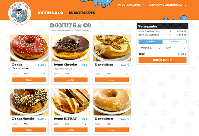
Captain Donuts uses great visuals to showcase each menu item and really create that emotional connection with the customer. Again, the layout is easy to navigate with menu items on one side and a running total in easy-view.
Always Test for Bugs
Over time, even with maintenance, you might find the odd error or just a simple outdated image/price/offering. Keeping everything up to date will eliminate the chance of a customer becoming dissatisfied because they can’t order what’s advertised, or a bug is stopping them from inputting their correct address.
Even a system that flags errors might miss things that are only relevant to your restaurant updates.
Shout About It
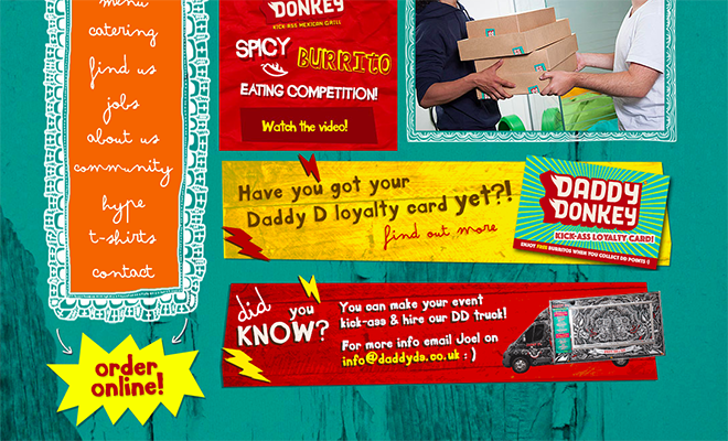
Customers need to be aware there is an online ordering option before they can place one. Even on your website, this should be plastered everywhere so customers can see the option. Not all traffic to your website will be coming to place an order in the first instance. Some of that traffic will be customers coming to look at your menu or find out your opening hours. You need to let these people know they can place an order online too to entice them to return and get an online delivery.
Let your offline customers know as well. Include reference to your online ordering option in-store, on menu’s on posters, flyers etc,. You could even ask staff to let paying customers know they can place an order online for future delivery if they so wish.
Overall customers are looking for two main things when they order online, ease of use and speed. We live in such a fast-paced world that everything must be fast! Fast but thorough without mistakes. If you have unnecessary pages and elements added to the online ordering process, consider reducing these to improve conversions and improve overall customer satisfaction.





Comments